


Dear Subscribers,
Happy new year!
Over the next several weeks, I'll be sharing a series of videos in 9 parts from an alla prima painting workshop recorded in August 2022. This recording is making its debut and hasn't been seen publicly on any other channels before.
The first video is free to watch for all my subscribers. Subsequent videos will be accessible to paying subscribers for a very modest subscription fee. I hope you find them interesting and useful.
Paying subscribers have the option of posting questions and comments in a private chat section on my substack.
Warm regards,
Alex

Here is a summary of the transcript of the video:
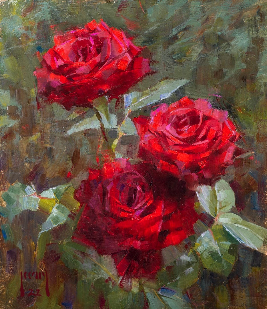
I've set up my workspace with a photograph of my subject on the left, the panel I'll be painting on in the middle, and my palette on the right. The panel is oil primed and tinted with raw umber.
For my colour palette, I've selected titanium white, cadmium yellow, cadmium yellow deep, vermilion, cadmium red, quinacridone red, rose madder, magenta, transparent oxide red, cobalt blue, ultramarine blue, and Payne's Grey. Although I won't use all these colours, they provide options based on my subject.
Examining my subject, I plan to use titanium white, transparent oxide red, magenta, rose madder red, and cadmium red. For greens, I'll likely use cadmium yellow, cadmium yellow medium, cobalt blue, ultramarine blue, and possibly Payne's Grey for mixing greys.
The lighting in my setup is from a 6,000 Kelvin LED panel, slightly cooler than sunlight. I've also prepared a painting board to suggest background outside, capturing the impression of foliage against flowers. This background board helps me visualize and develop the painting.
I briefly discussed arranging the still life, emphasizing the compositional process, lighting considerations, and personal choices in arrangement. The roses in my setup took over an hour to arrange, but I spared the audience the details in the workshop. My prepared background board, which is dry, serves as a foundation for the painting.
In arranging my roses for the painting, I initially considered spacing them further out to create a sense of depth. I contemplated having one rose further away to simulate atmospheric effects but eventually opted for a setup where one rose is on top of the other, casting a shadow. The reference photo on the left reflects the darker bottom rose with most light falling on the top two, creating variety in terms of light and shadow patterns.
To establish my composition, I used L-shaped card pieces as a viewfinder, matching it to my panel. The chosen panel is larger, making the work bigger than life-size. While I sometimes use callipers for life-size work, flowers offer more drawing leeway. Today, I'll skip the initial measurements, as I plan to adjust elements to fit the larger frame.
Before diving into the painting, I need to step back and study the subject. Analysing colour involves considering value, chroma, and hue. Value relates to darkness or lightness, chroma to saturation, and hue to the colour itself.
Next, I'll slightly squint at the subject to simplify values. Sharing a graphic on composition, design, and idea, I emphasize the importance of a clear concept when setting up the subject. This initial understanding guides the subsequent steps in the painting process.
The next consideration is how the subject fits into the picture frame, involving drawing and shapes. The subsequent level is the value, encompassing lights and darks. Squinting at the subject simplifies these value relationships, turning the details into a more graphic and illustrative quality.
When fully open-eyed, I can discern various shadow values within, for instance, the shadow of a rose. However, squinting diminishes these differences, simplifying everything. This simplification guides the initial blocking for the painting. For instance, a rose may appear as one value in the light and another in shadow. To capture this, I group all the values in the light as one to start.
Working from life is preferred over photos due to their inability to convey subtleties. Even though a rose closer to the light may seem darker due to the distribution of light, a deeper understanding reveals the nuances. Considering the background's darkness relative to shadow values adds to this understanding, establishing a hierarchy of values.
This hierarchy is crucial for representational painting, where value takes precedence, followed by chroma and temperature relationships. Cool lights make lights cooler than shadows, while warm lights, like direct sunlight, result in cooler shadows. Understanding these relationships informs the painting process.
In impressionist works, artists often exaggerate the warm-cool relationship between light and shadows. However, this principle may not always hold true in reality, necessitating a closer examination of the subject. Temperature relationships, primarily related to hue, play a role in this and are crucial in understanding the nuances of light and shadow.
Moving up the pyramid of considerations, the next level involves edge relationships. Squinting at the subject reveals distinctions in edge hardness. For instance, some areas exhibit sharp edges, while others display softer, merging edges. While some painters may prefer uniformly sharp edges, exploring variations in edge relationships provides an additional visual language to express aspects of the subject.
At the pinnacle of the pyramid are paint texture and abstraction. Although not essential, they contribute an extra layer to the artwork. Paint quality, including thickness, thinness, and visible brushstrokes, adds a tactile dimension to the piece. This tactile quality, unique to traditional paint compared to digital media, enhances the overall visual experience with elements like transparency and opaqueness.
In comparison to elements lower down on the pyramid, paint texture and abstraction play a minor role in representing the subject. The hierarchy presented in the pyramid is not fixed, allowing flexibility in prioritizing different aspects based on artistic intent. For example, one might emphasize edge relationships or chroma, deviating from reality for artistic effect.
This hierarchy serves as a guide rather than a strict rule, providing the artist with the freedom to choose what elements to emphasize and what to downplay. Awareness of these elements allows for informed decision-making during the painting process.
Using walnut oil, specifically an alkyd version for faster drying, I began the composition with transparent oxide red for initial drawing. A walking cane hooked over the easel aids in steadying the hand during this process. Emphasizing the importance of consistent positioning, I avoid the problem of parallax by standing back from the subject.
Straight lines are favoured over curves for drawing, as they provide better shape judgment. The use of imaginary plumb lines and considering the planes of the subject, akin to fitting it into an imaginary cube, assists in understanding orientation and dimensionality.
As the drawing progresses, I continued to observe the subject, squinting and analysing value shapes, emphasizing the importance of standing back to maintain a consistent viewpoint.
I use a small brush, specifically an extra-long flat, to loosely indicate the positions of leaves. Given the time constraints, I prioritize capturing the overall feel rather than dwelling on precise details.
Moving forward, I delve into the concept of "darkest dark, lightest light" to set the range of values. While typically aiming to match what I see, I discuss the option of intentionally shifting values for varied effects. There is a caution about challenges in maintaining color in dark areas when using the full value range. I share insights into strategies for managing values, considering the compromise between shadow colour and light chroma. Identifying the darkest dark in a shadow area, I decide to introduce colour into the shadow, opting not to go completely black. The mixture involves transparent oxide brown, magenta, and a touch of ultramarine blue.
I organize my brushes, placing the smallest ones at the top and larger ones at the bottom. The brushes I'm using today are either Rosemary & Co. ivories or extra-long combers. The combers are softer and ideal for softening edges or creating gentle strokes in later stages. The Ivories are harder bristle brushes. I group them based on warm and cool colours, ensuring I don't mix brushes for different colour groups to prevent contamination.
As I use a brush to mix, I emphasize the importance of avoiding cross-contamination and suggest using a palette knife for mixing whenever possible. I begin adding values with a brush, focusing on alla prima, where considerations include values, chroma, and, to a certain extent, edges. In this initial stage, my main focus is on values, and I use walnut oil as a solvent, emphasizing its effectiveness compared to linseed oil.
After adding the darkest dark, I proceed to introduce the lightest light, emphasizing that, in alla prima, aspects of value, chroma, and drawing need simultaneous consideration. I use a brush for mixing but emphasize the importance of doing so with a palette knife when dealing with single colours.
I wanted to highlight a challenge with red roses—their high saturation makes it challenging to accurately judge values. In Photoshop, I demonstrated how converting a photo to monochrome can reveal the true value relationships. Despite the perception of a well-lit red rose, the values may be darker than expected. This understanding is crucial for maintaining accurate relationships in the painting.
I show the middle rose on the right appears lighter than the top one, emphasizing the importance of careful observation. While there are minor highlights on leaves, I prioritize the significant shapes. Although I may not go as dark as the monochromatic representation suggests, this exercise helps me gauge the potential challenges and informs my approach to the values in the painting.
